Company Information
“נוף חדש” is a real estate brokerage company specializing in the sale, rental and investment in private and commercial properties, with an emphasis on personal service and professional guidance throughout the process.
Project Overview
The objective of this project was to develop a distinctive and trustworthy brand identity for the real estate company “נוף חדש”. The vision was to craft a brand that embodies innovation, stability, and the fulfillment of dreams within the real estate market. The design goal focused on creating a clear, minimalist logo that evokes a sense of calm, reliability, and the promise of a fresh beginning.
Branding
Logo
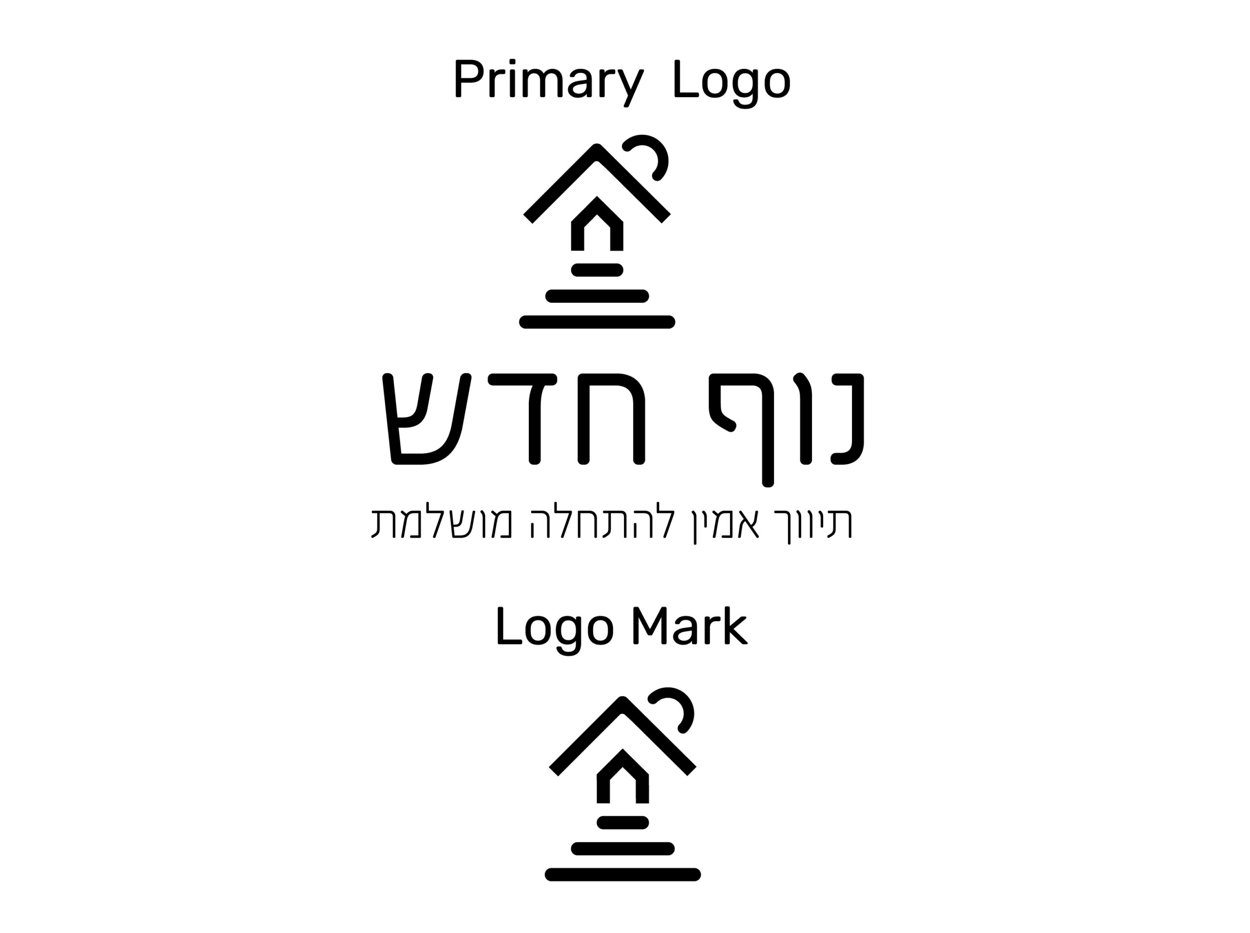
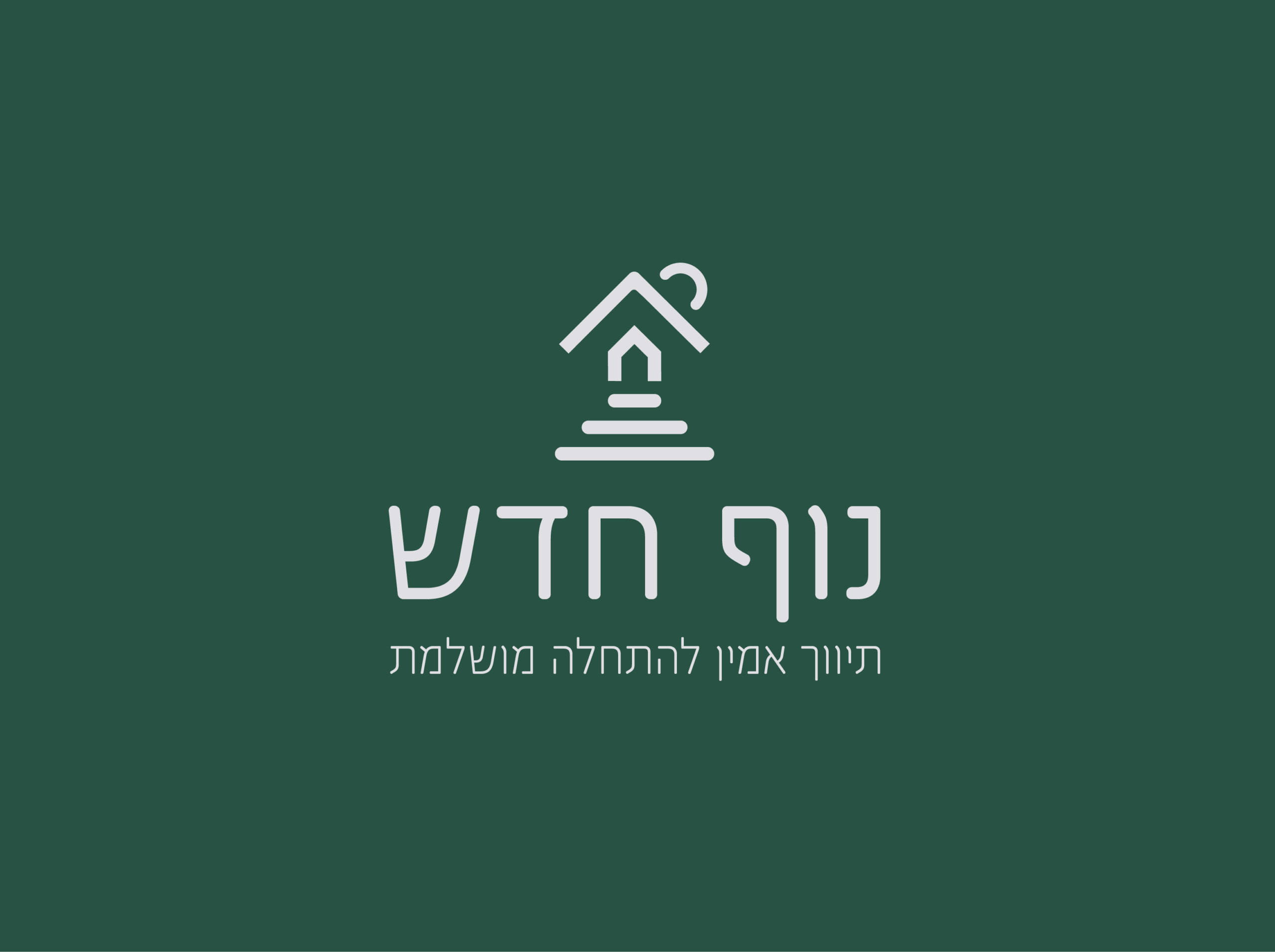
The logo concept is inspired by the idea that acquiring a property marks a new beginning for the client, always offering a fresh view. The design combines the shapes of a mountain, house, vista and trail, symbolizing stability, harmony, and the journey ahead. Created using a precise geometric grid to ensure clarity and balance.
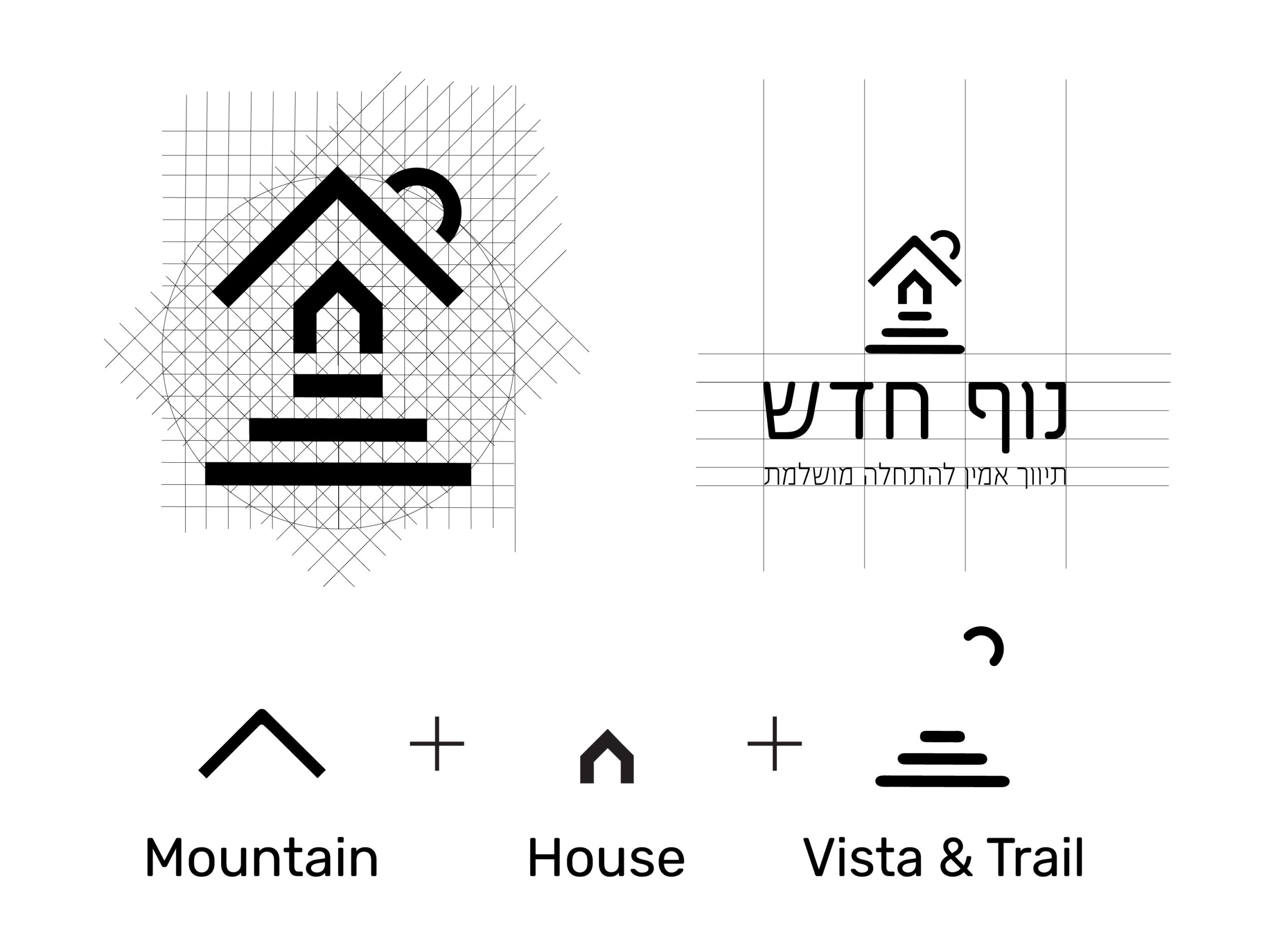
Final Logo Design
The harmonious composition combines nature and home in a simple, readable sign. Infusing modern typography, it conveys trust, comfort and a strong brand presence.
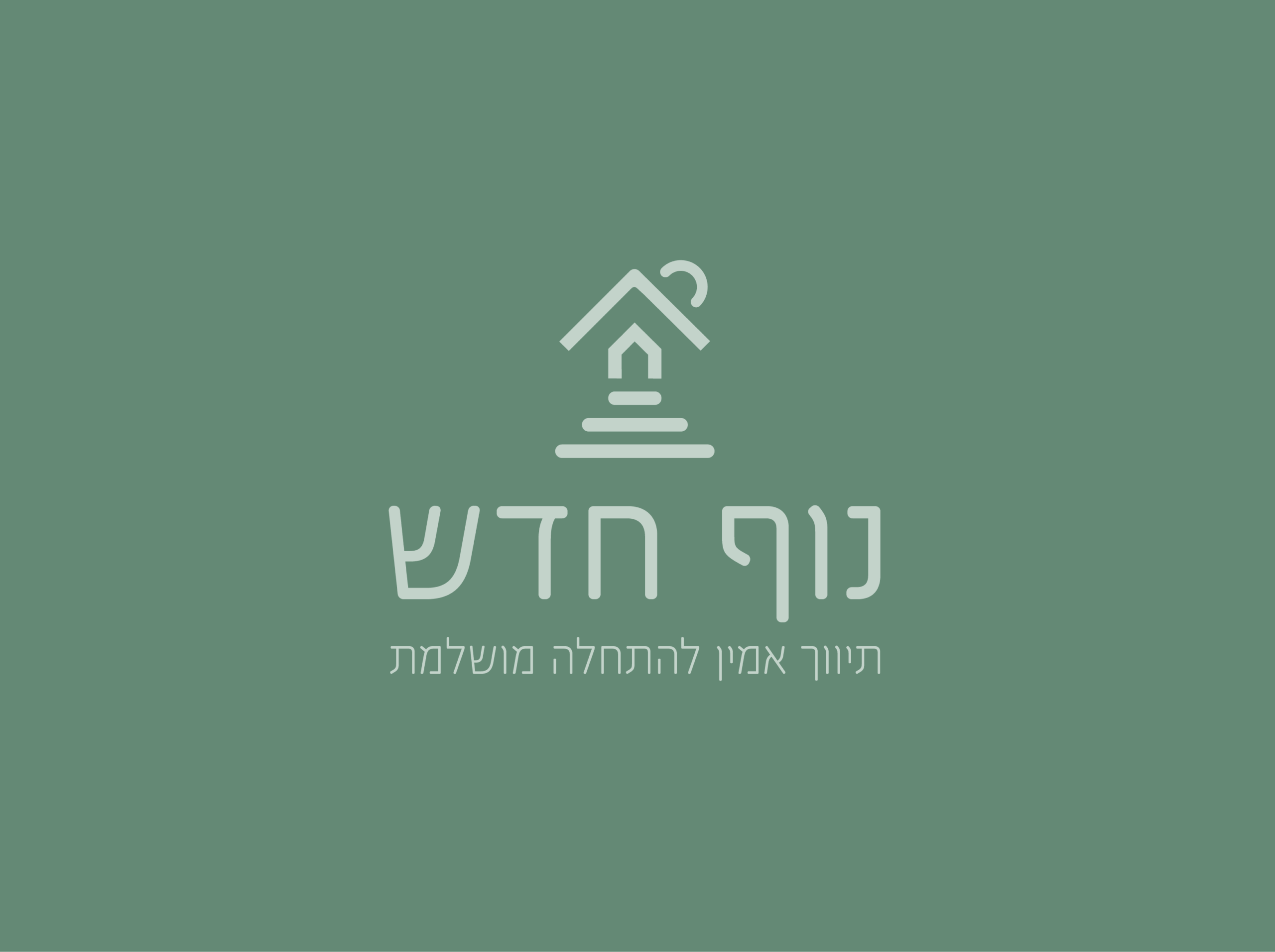
Branding Color
This color palette was chosen to reflect the essence of “נוף חדש” – a brand rooted in nature, renewal and innovation. The greens evoke growth, harmony, and stability, while the blues convey trust, professionalism, and depth. Soft neutrals balance the composition, adding clarity and calmness, symbolizing a fresh start and the promise of new horizons.
Viridian
#648975
Brunswich Green
#285243
Platinum
#e0e0e4
Indigo Dye
#2b4e67
Ash Grey
#c4d4cb
Typography
Pauza – a clean and modern sans-serif font that ensures legibility while adding a contemporary, sophisticated touch to the brand.
No Images Found!
Logo Usage
The logo is presented in the brand’s core color palette, ensuring it reflects the full identity and personality of the brand while maintaining clarity and visual impact across various applications.


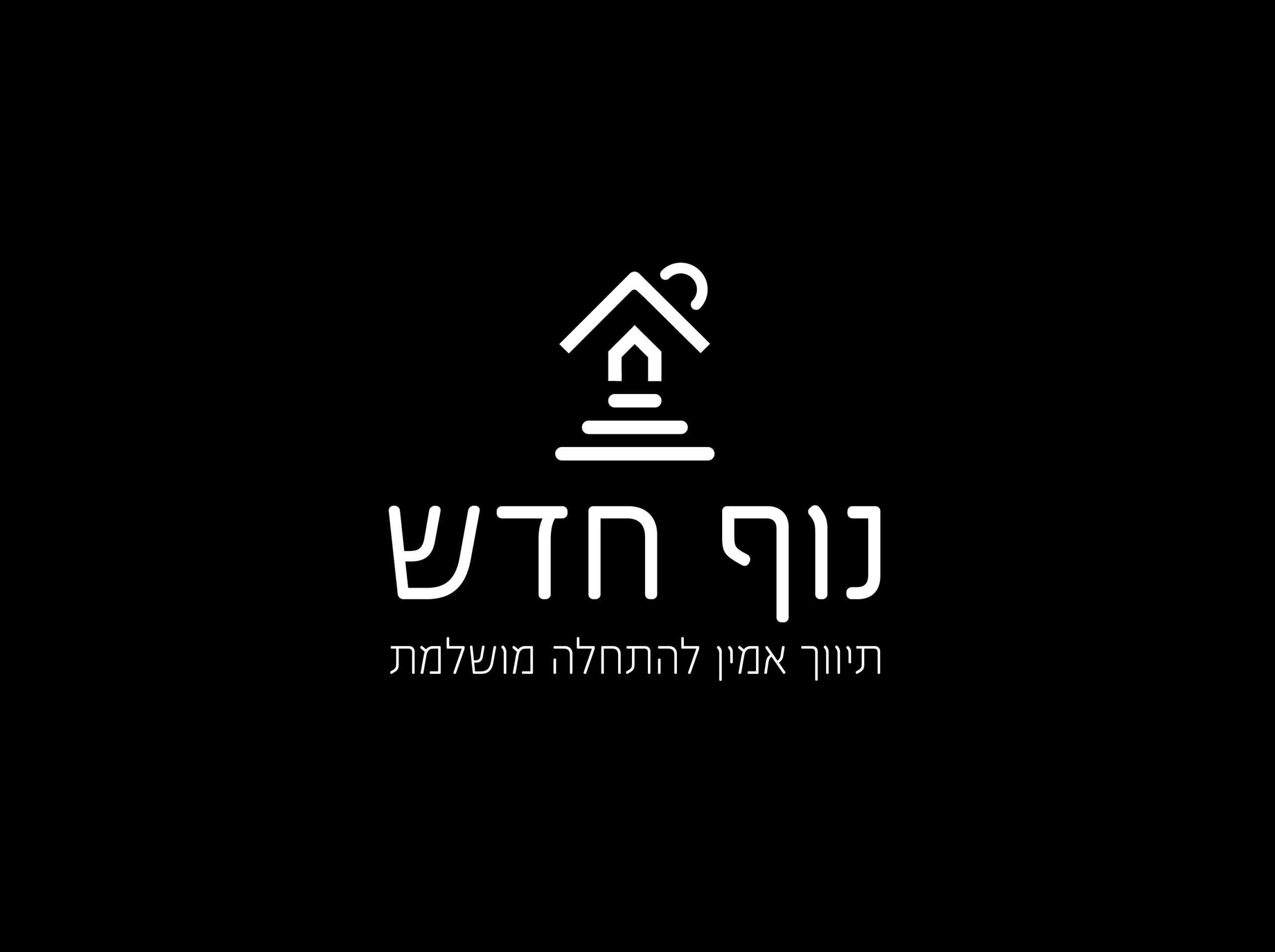
Logo Usage
The logo is displayed in monochrome variations, guaranteeing visibility, contrast, and elegance on both light and dark backgrounds, while preserving brand recognition.


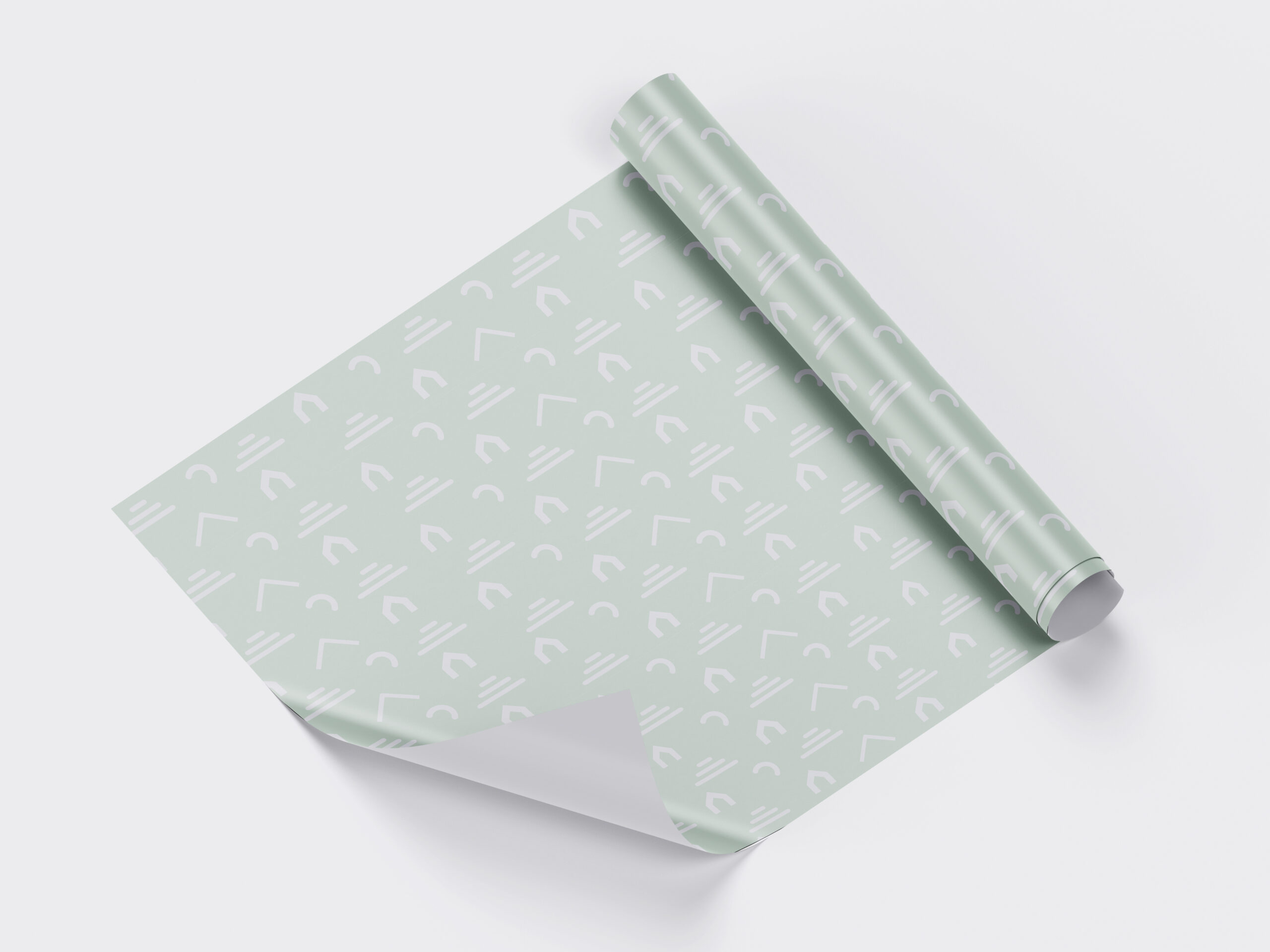
Pattern
The Gift Box uses paper decorated with a custom motif inspired by the brand’s distinctive visual elements. This carefully considered design choice adds both uniqueness and memorability to the packaging, thereby enhancing the unboxing experience for recipients.
Marketing and Branding
The marketing strategy was focused on building a brand that offers personal attention to each client, accompanying them from the very beginning of their search for a new home until they receive their desired property. To reduce the stress of moving, clients are provided with branded moving boxes and keychains. A distinctive element from the logo was incorporated into all promotional materials, serving as a recognizable symbol that allows people to immediately associate it with the company even without the full logo.