Company Information
Food Delivery Company
Project Overview
This project involved designing a professional, user-friendly dashboard tailored for the restaurant food delivery industry. The goal was to create a centralized platform where restaurant managers and staff can efficiently track, manage, and analyze all aspects of food orders and deliveries in real time. The dashboard is focused on providing clear insights into key operational areas such as order performance, delivery efficiency, customer satisfaction, and menu activity – all essential for optimizing logistics and enhancing the customer experience.
2025 Student Project
Dashbord/Branding/UI Design
Tools
Midjorney
Logo
Logo Construction
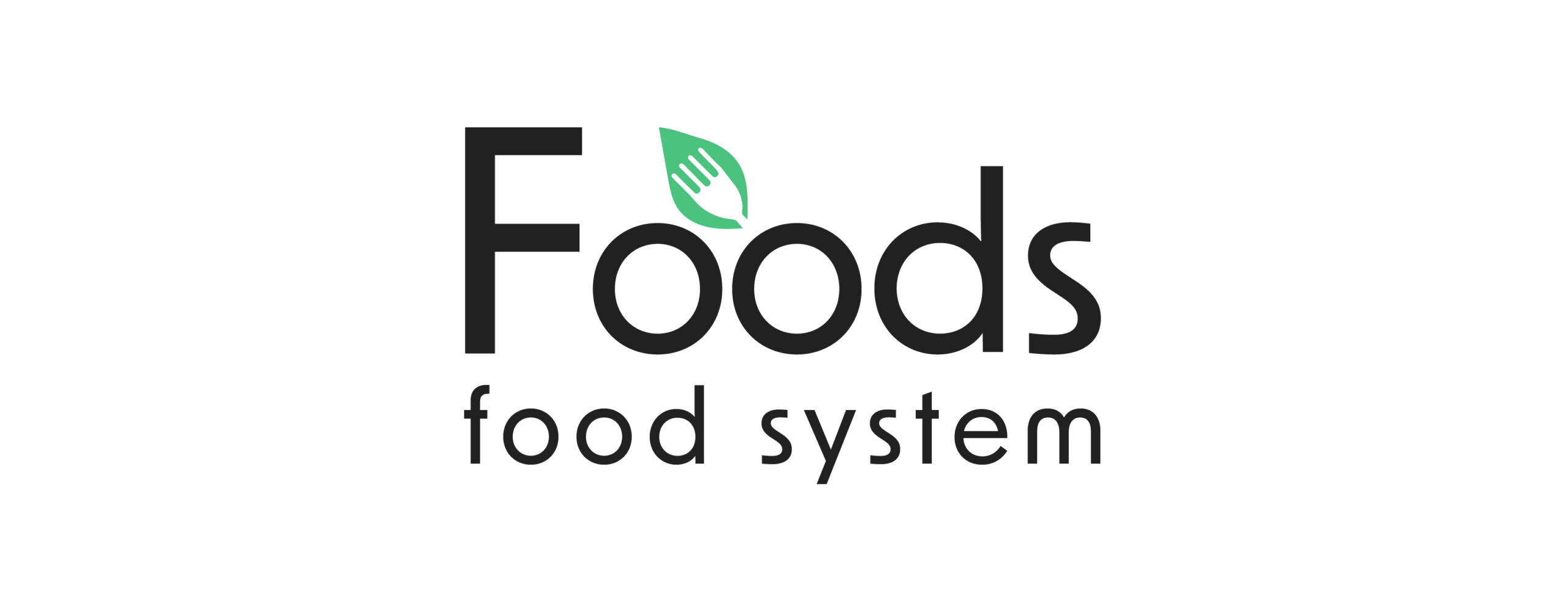
The idea for the logo was inspired by a simple yet universal detail: in gastronomy, a “leaf” is often added as a final touch to dishes, while decorative prints are frequently used to elevate presentation. By merging a “leaf” with a “fork”, the logo conveys both the natural, fresh aspect of food and its direct connection to dining. This combination creates a symbolic identity that is recognizable, versatile, and tied to the aesthetics of culinary culture.
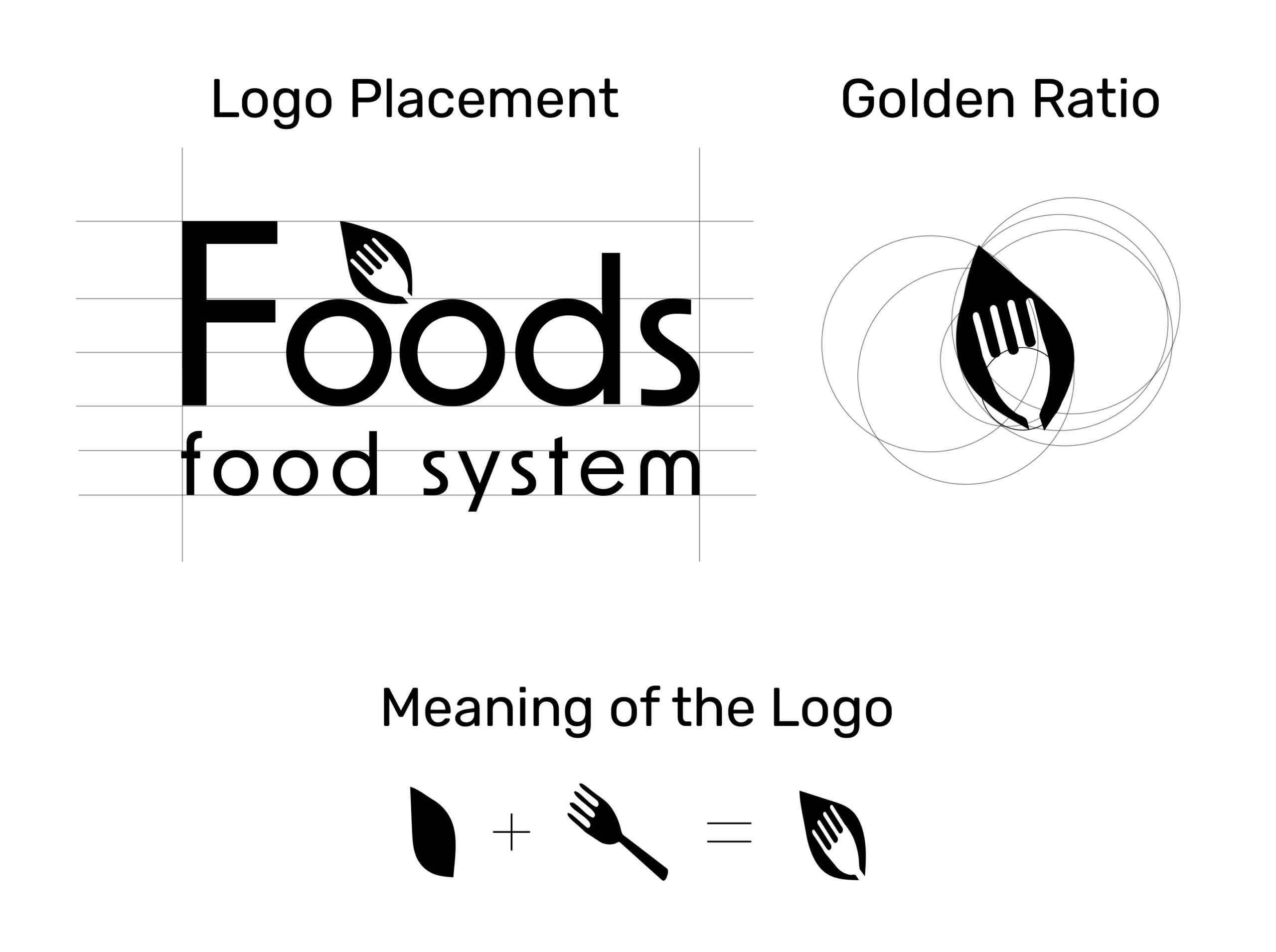
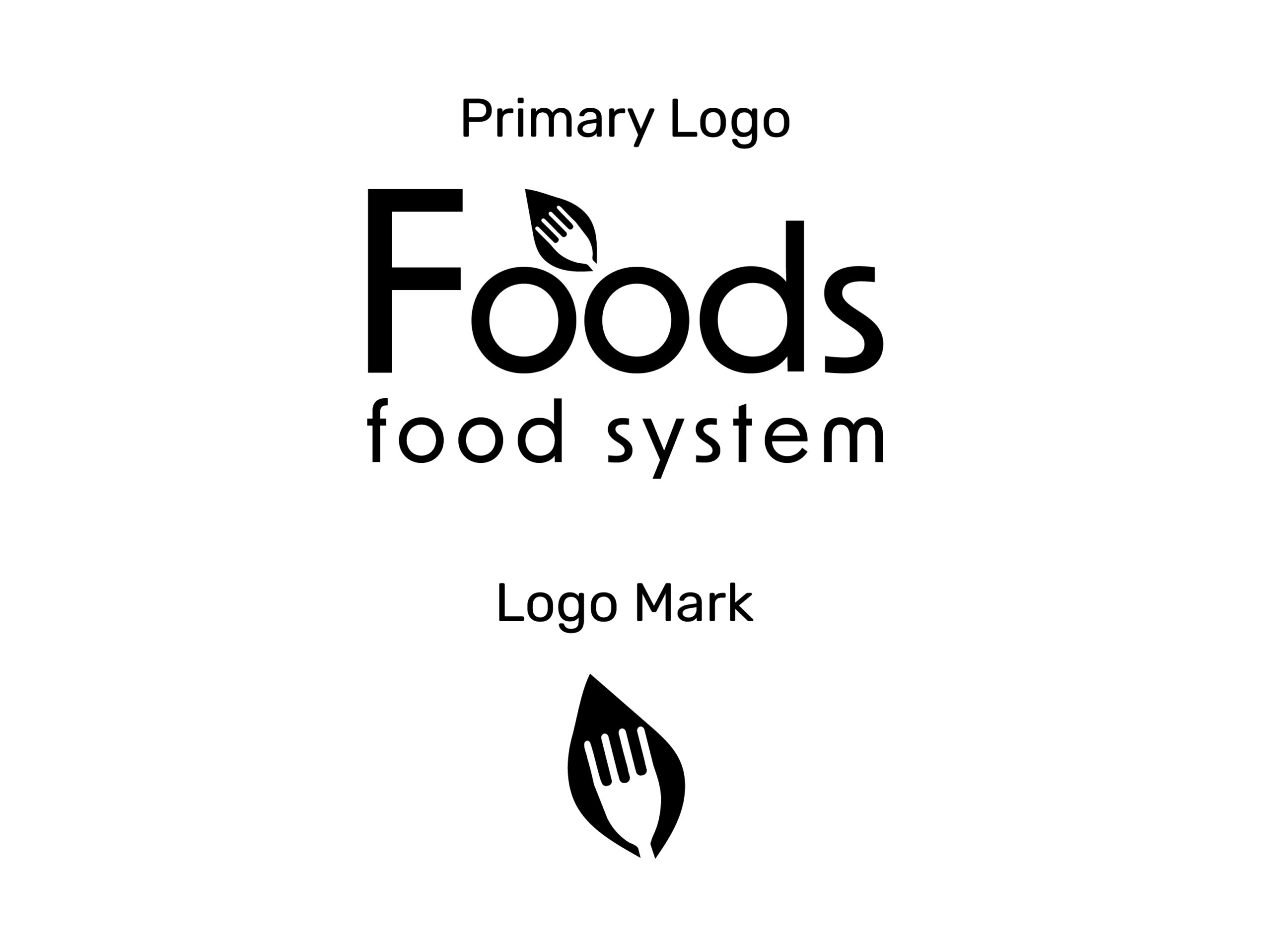
Final Logo Design
Logo Design
The symbol is placed above the wordmark, creating a centered, well-balanced composition. This approach allows the icon to function independently when needed, while maintaining harmony with the text. The minimalistic and flexible structure ensures the logo works consistently across different media and scales.
Branding Color
Color Palette
Green emphasizes nature, freshness, and eco – friendly values. Orange adds warmth, energy, and appetite stimulation, making the logo more engaging and dynamic. The complementary contrast between green and orange creates a lively and appealing visual identity.
Emerald
#4BC27E
Princeton Orange
#FF9505
Eerie Black
#212121
Anti-Flash White
#F4F6F8
Typography
Font New Order
A clean, rounded sans-serif font was chosen for its modern, approachable, and highly legible qualities. The typography provides balance to the symbolic icon and ensures adaptability across both digital and print formats.

Logo Usage
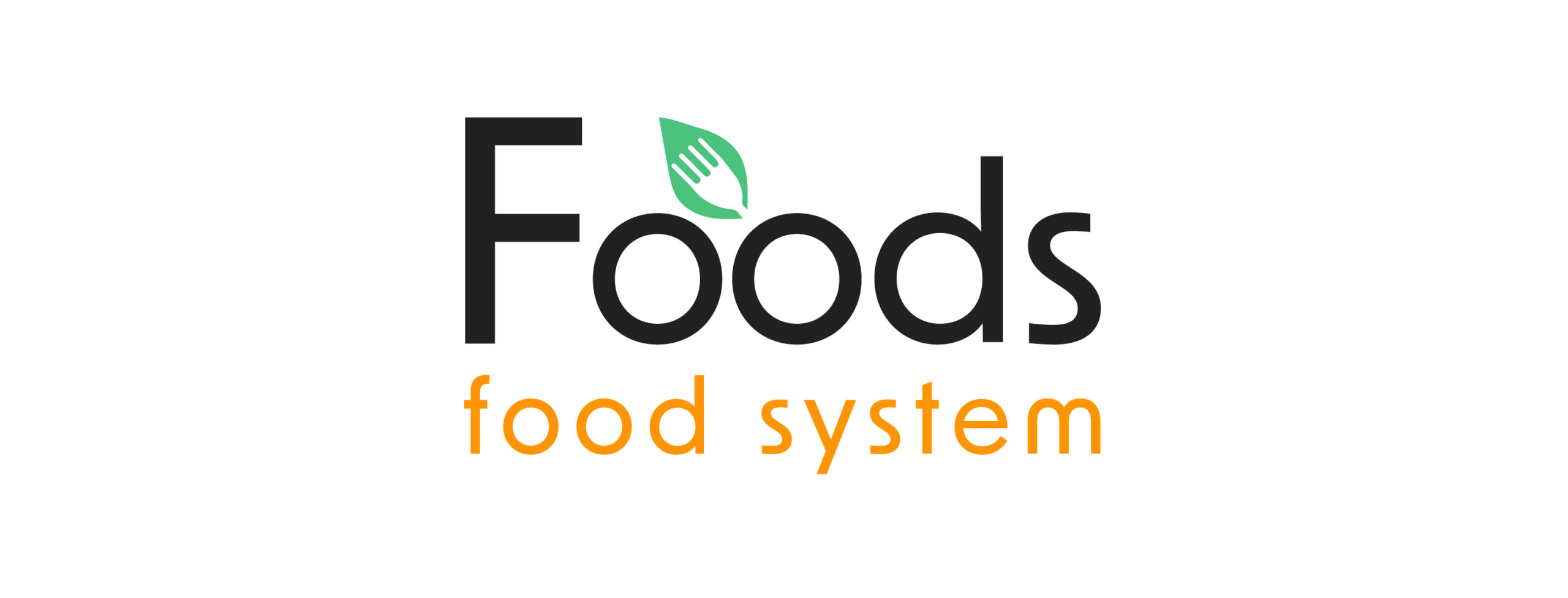
Branding Color
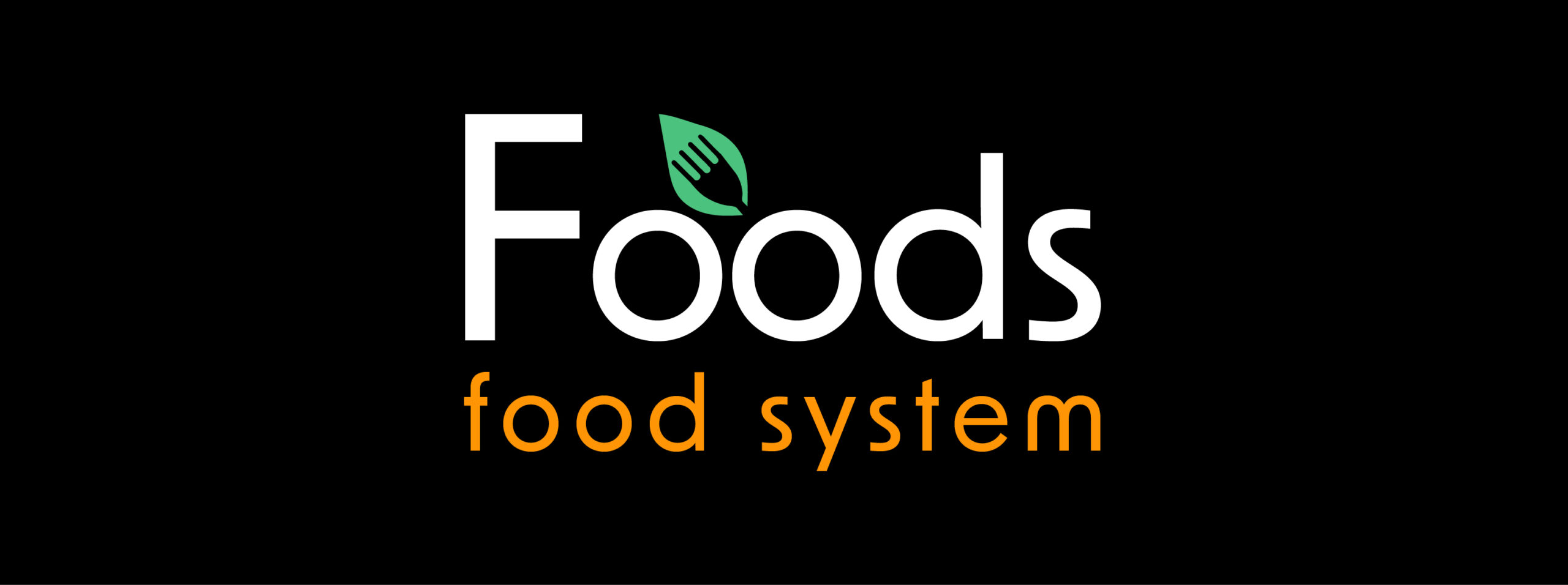
The logo is consistently presented in the brand’s core colors to ensure recognition and versatility. The green leaf icon is paired with a black wordmark, providing a clear and timeless foundation. The slogan is adaptable in two variations: green, reinforcing freshness, natural values, and alignment with the symbol and orange, introducing contrast, energy, and appetite appeal, making the identity more dynamic and engaging. This flexibility allows the logo to maintain coherence while adjusting its tone to different contexts and communication needs.

Logo Usage
Monochrome Color
The logo is displayed in monochrome variations, guaranteeing readability, contrast, and elegance on both light and dark backgrounds, while preserving brand recognition.
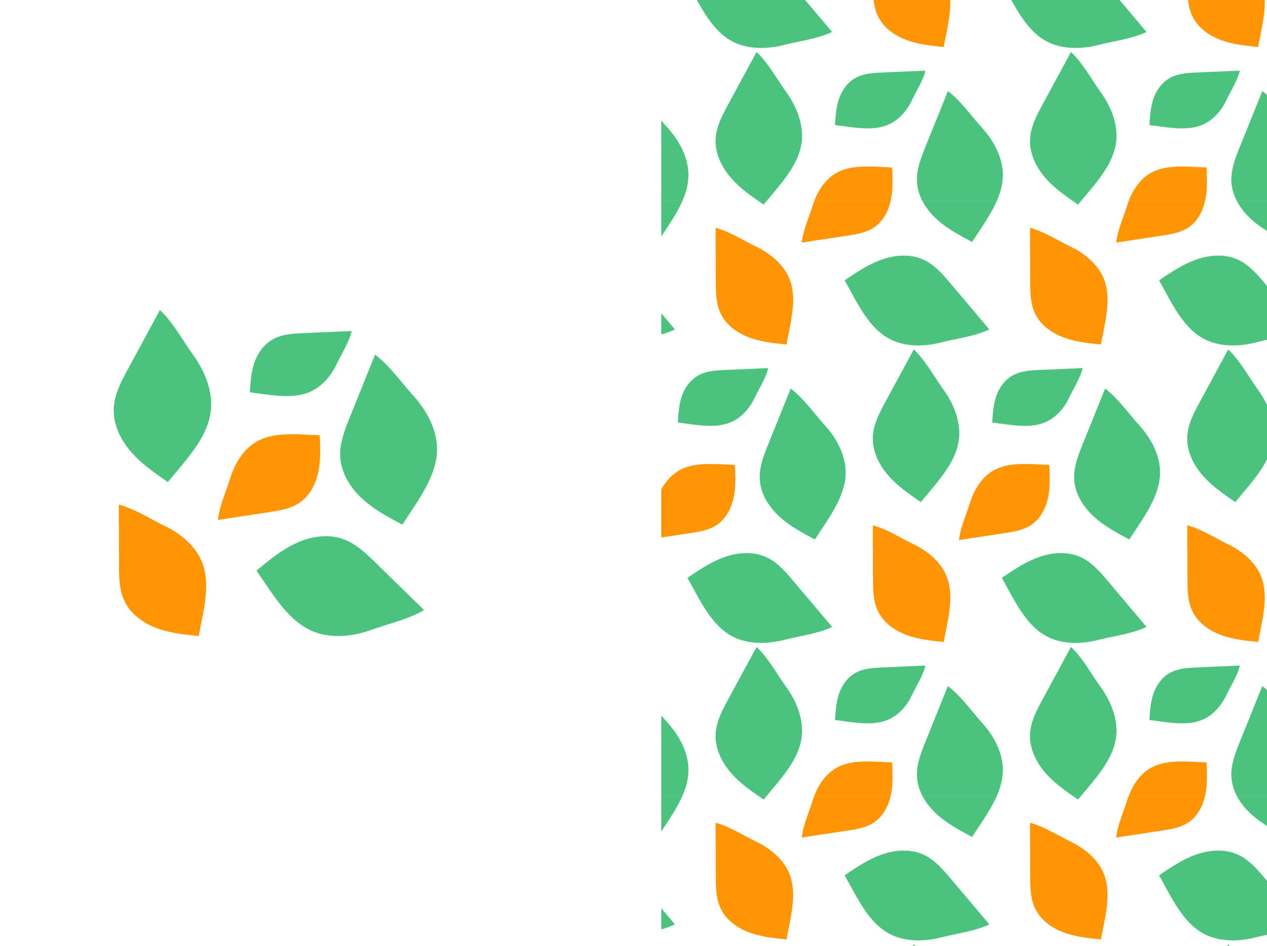
Pattern
Design
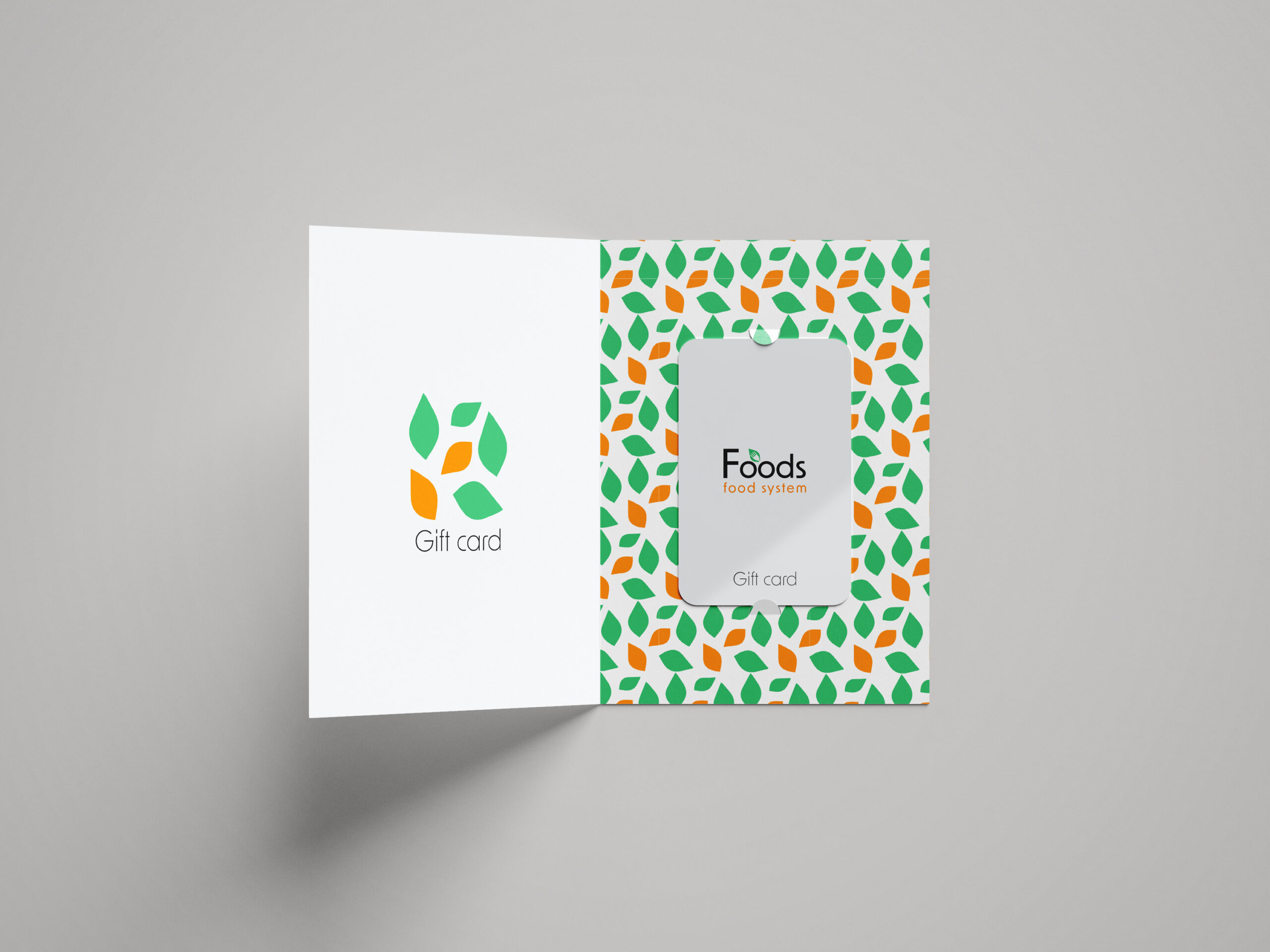
This pattern of green and orange leaves was meant to show freshness and positive energy. It was used in the design of a gift card, which added to the overall visual identity.
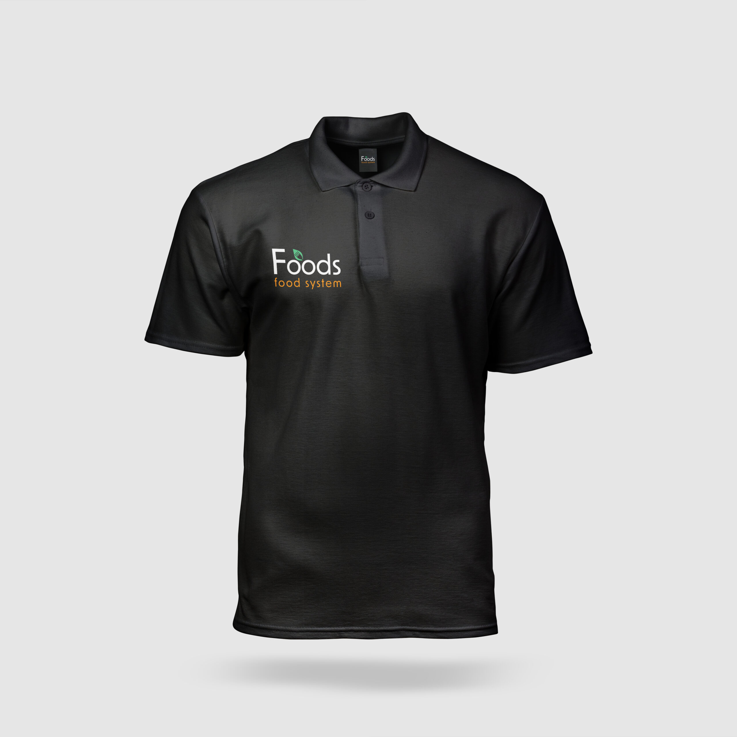
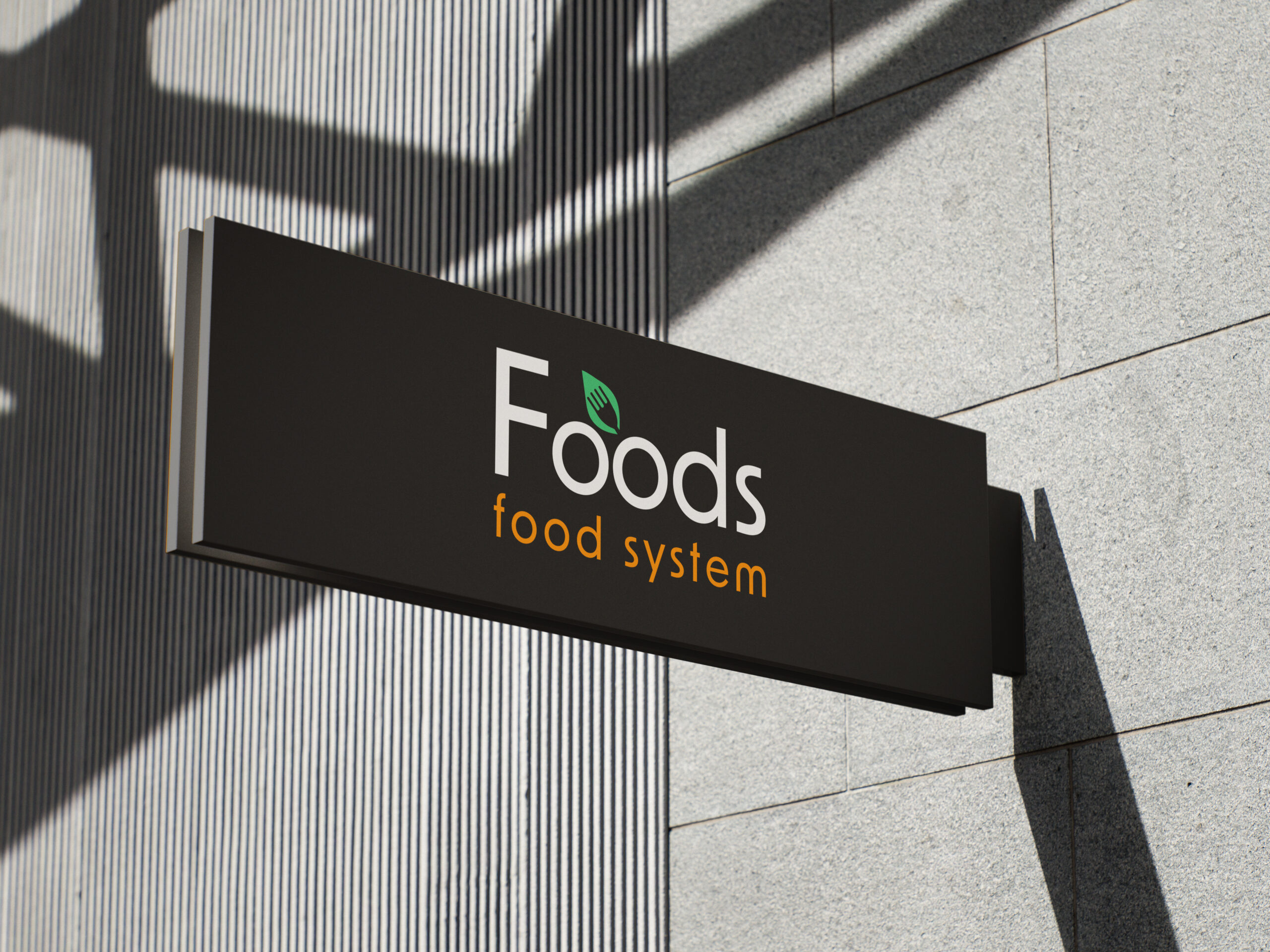
Mockup
Design
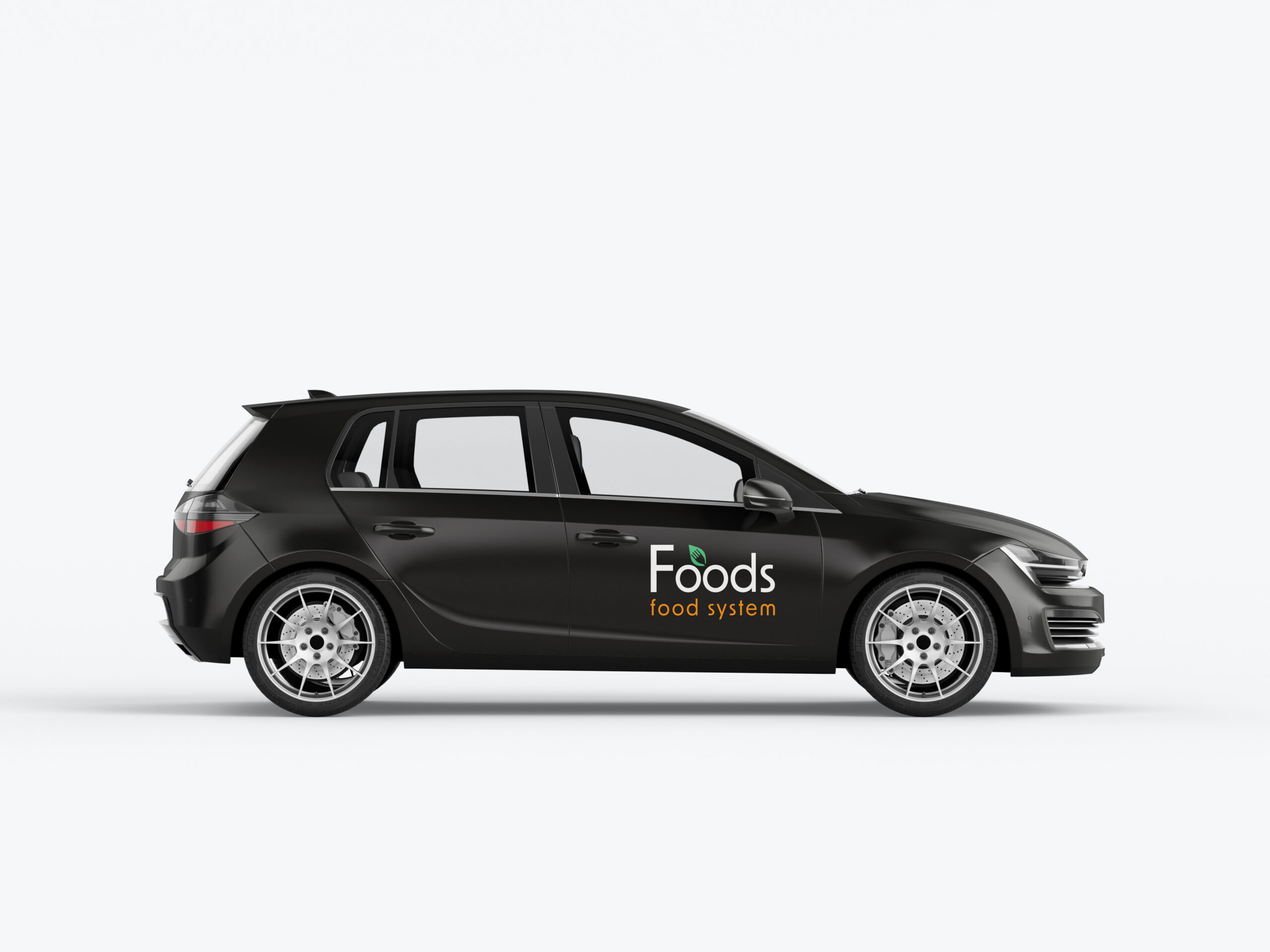
To demonstrate the versatility and practical application of the logo I created a series of mockups showcasing its use on building signage, apparel, vehicle branding and employee badges.
Let's Create Something
Great Together
Have a Project in Mind?