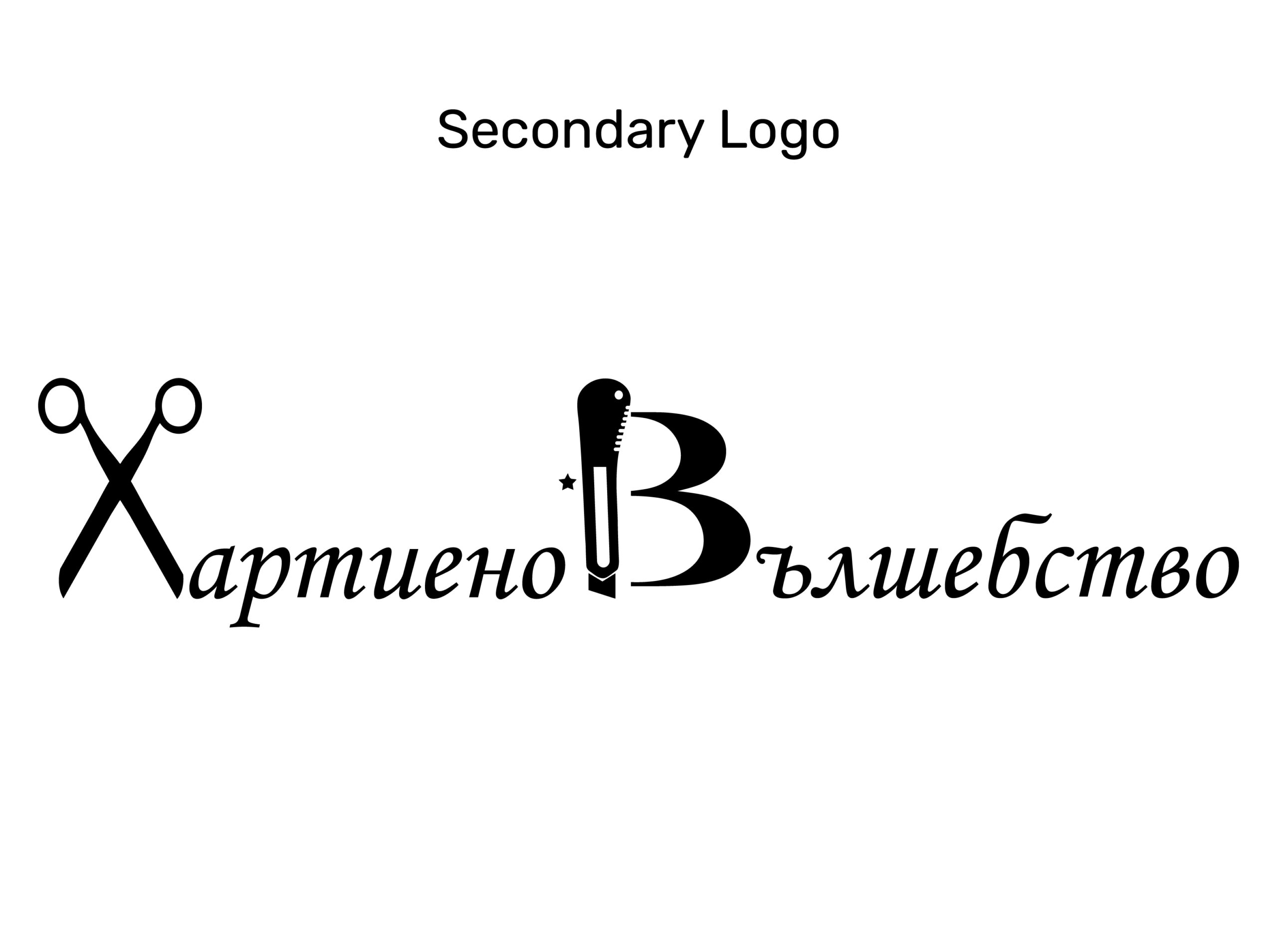
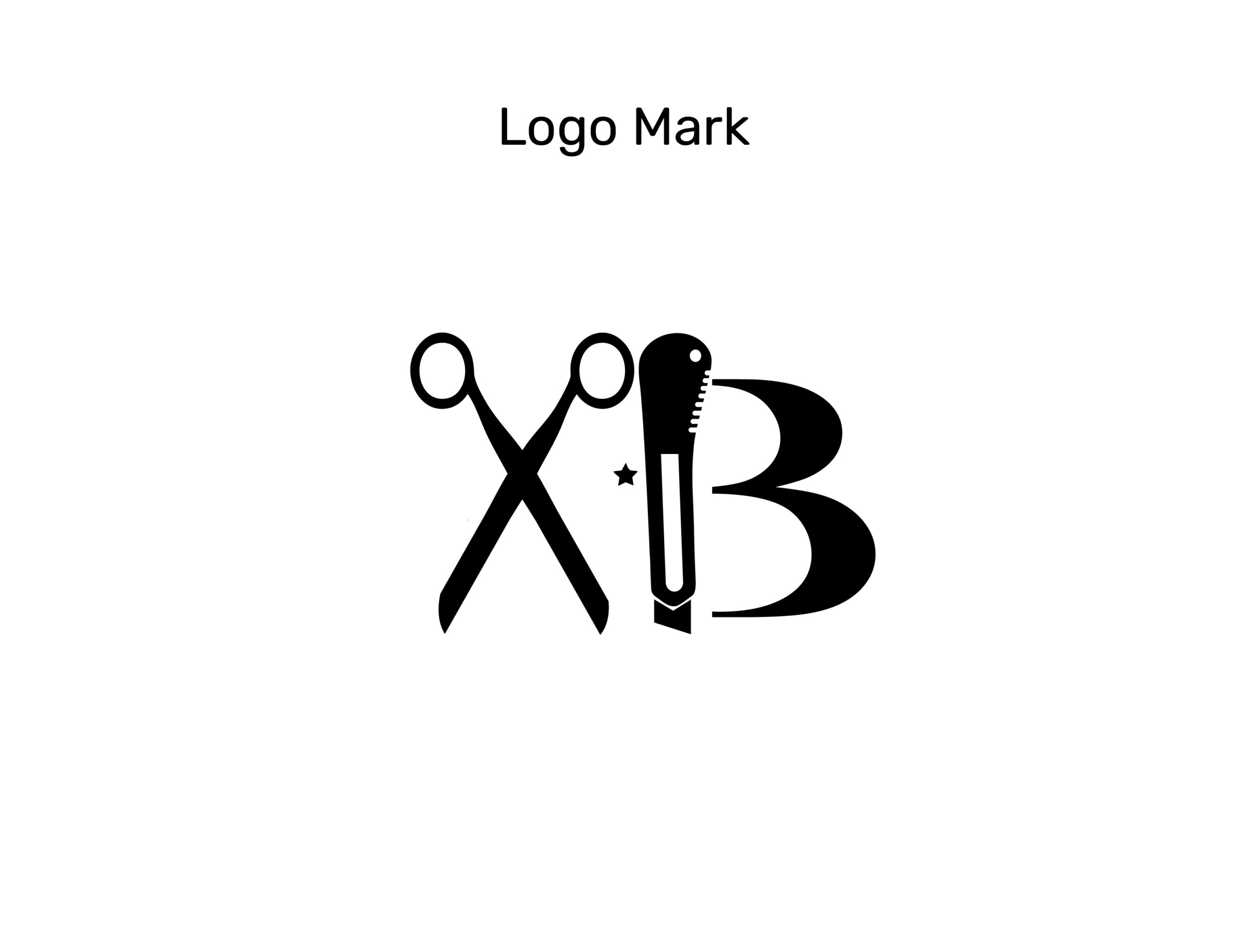
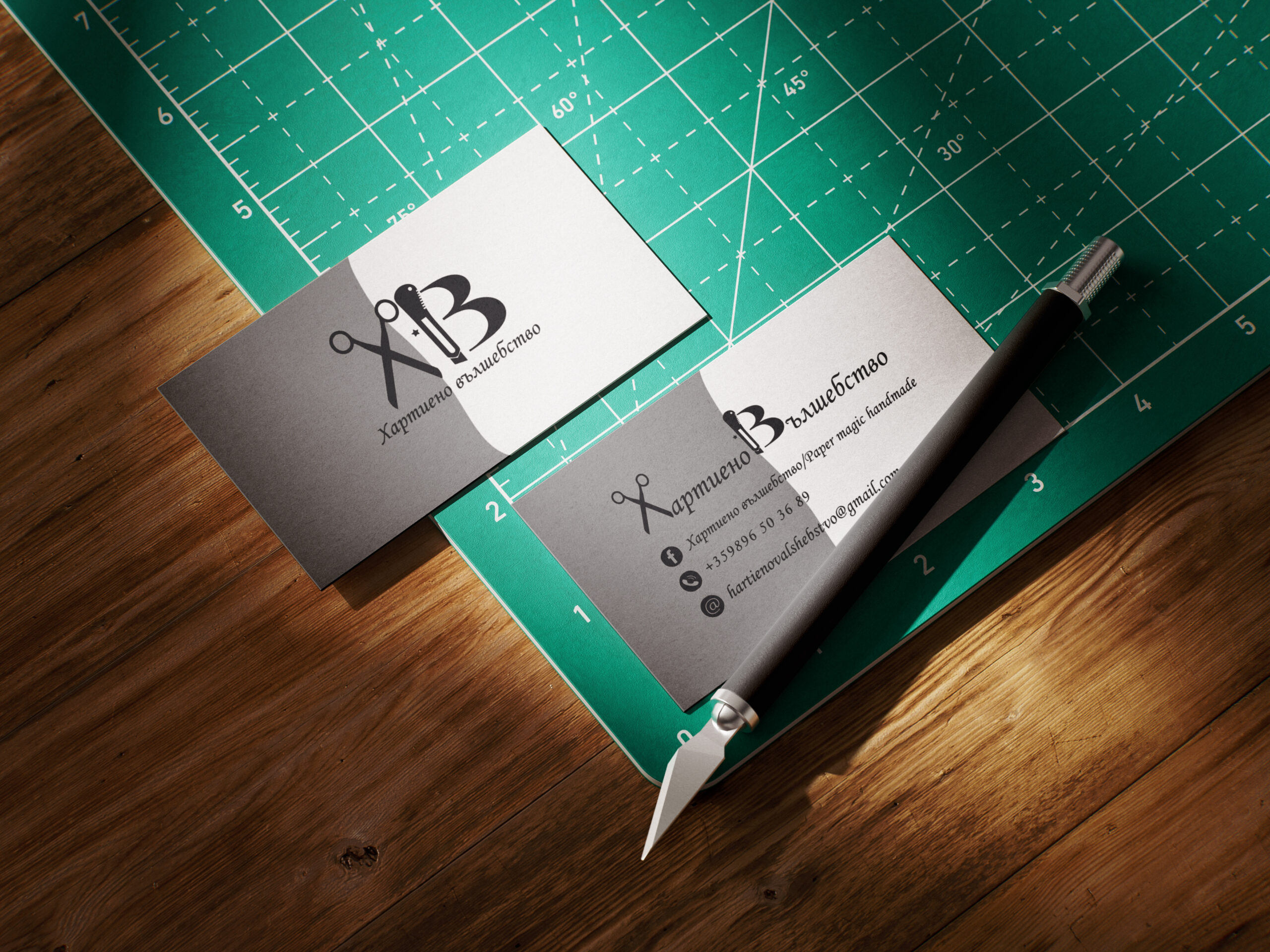
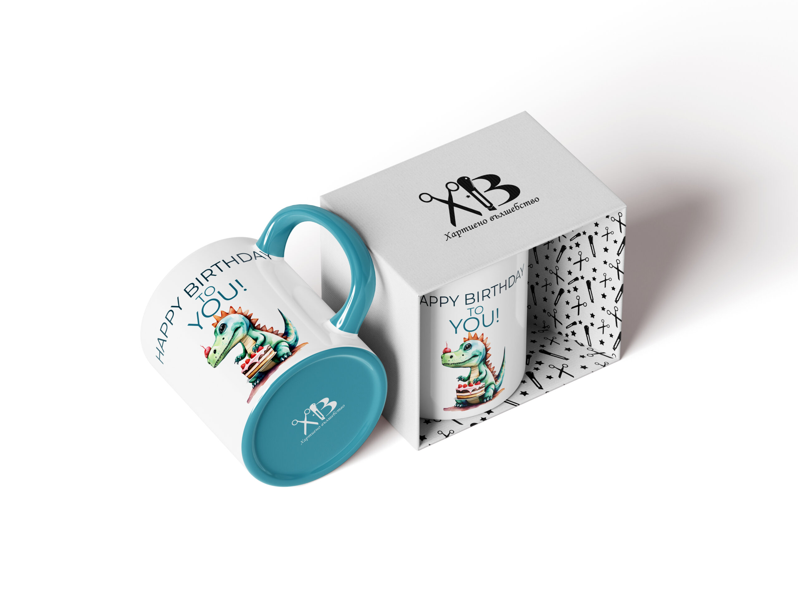
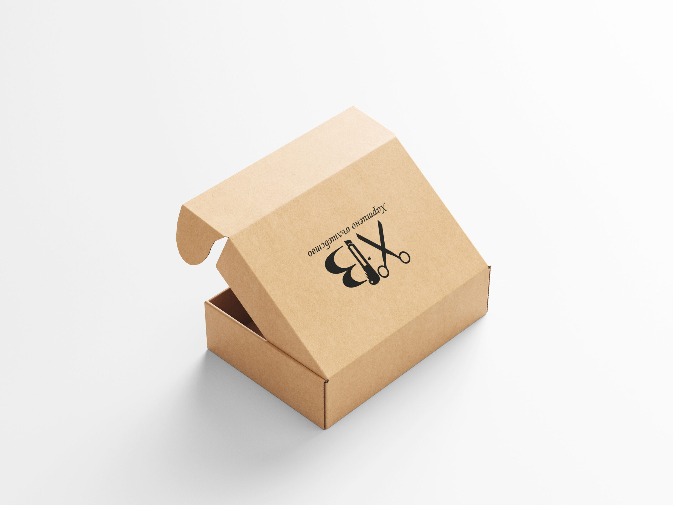
Company Information

“Paper Magic” is a small family – owned business specializing in handmade paper creations, including boxes, greeting cards and custom cardboard box, card and  album.

Project Overview

The goal of my project was to create a brand that conveys a sense of uniqueness, personality, and inspiration. A brand that shows it offers not just paper products, but little pieces of magic – boxes, cards and cardboard box, cardboard card, cardboard album that bring joy and add value to special moments.

Client Project

Branding

Tools
Adobe Illustrator Adobe Photoshop

Logo

Logo Design

The logo combines symbols related to the personal story of how the business started with just a pair of scissors and a craft knife, which I used to create the letters “X” and “B.” This creates a visual identity that simultaneously hints at the manufacturing process and emphasizes the creative direction of the brand, but also includes elements that have sentimental value for the client. The main logo is elegant and legible, and the additional variants ensure flexibility for different applications – business cards, labels, bags and stickers.

Branding Color

Color Palette

The color scheme includes: White – symbol of purity, simplicity, and new beginnings. Gray – balanced, modern and universal. Black – elegance, contrast and professionalism. This combination is clean, minimalist and modern allowing the products and designs to stand out on their own.

Battleship Grey

#939393

Black

#000000

White

#ffffff

Typography

Font Monotype Corsiva

The font used is Monotype Corsiva – a classic and elegant cursive font. Its style conveys a sense of sophistication, artistry, and personal touch, which fully reflects the brand’s values –  craftsmanship, attention to detail, and an individual approach.

Logo Usage

Branding Color

The black and white version provides maximum flexibility. It emphasizes the shapes and typography of the logo making it easily recognizable and adaptable to different media and backgrounds.

Logo Usage

Monochrome Color

The logo is displayed in monochrome variations, guaranteeing visibility, contrast, and elegance on both light and dark backgrounds, while preserving brand recognition.

Pattern

Design

The gift box is crafted from paper decorated with a custom motif inspired by the brand’s distinctive visual identity. This thoughtful design choice highlights the artistic essence of “Paper Magic”, adding uniqueness and memorability to the packaging while enhancing the unboxing experience with a touch of creativity and charm.

Mockup

Design

The marketing strategy was focused on building a brand that conveys uniqueness, personalization and inspiration. Each customer receives not just a paper product but a carefully crafted piece that adds meaning to their special moments. By integrating the logo across packaging and promotional materials the brand delivers a consistent visual language that fosters recognition, trust and an emotional bond with its audience.

Business_Card_on_Cutting_Mat_4
CUP
Bag_on_the_Bench_Mockup
Mailer_Box_Mockup_5
Load More

Thank you for watching!

Let's Create Something
Great Together

Have a Project in Mind?
Contact Form
Name
Checkboxes
Scroll to Top