Information
SWAP – App
Project Overview
As part of our UI/UX course at John Bryce, my team and I worked on the development of SWAP – an innovative application that connects people who have money but lack of time with those who have time and want to earn. The platform allows anyone to post a task – whether it’s a small repair, running errands, help with work, or other daily needs – and offer a payment for its completion. Others can accept and perform these tasks, creating new opportunities for flexible income. Our goal was not only to design an intuitive interface but also to deliver a complete product experience. By doing so SWAP has the potential to diversify the traditional labor market and empower individuals to work on their own terms, with freedom and independence. In the following section I will showcase the branding of SWAP including the logo, typography, color palette and visual identity that define the app’s character.
2025 Student Project
Branding
Tools
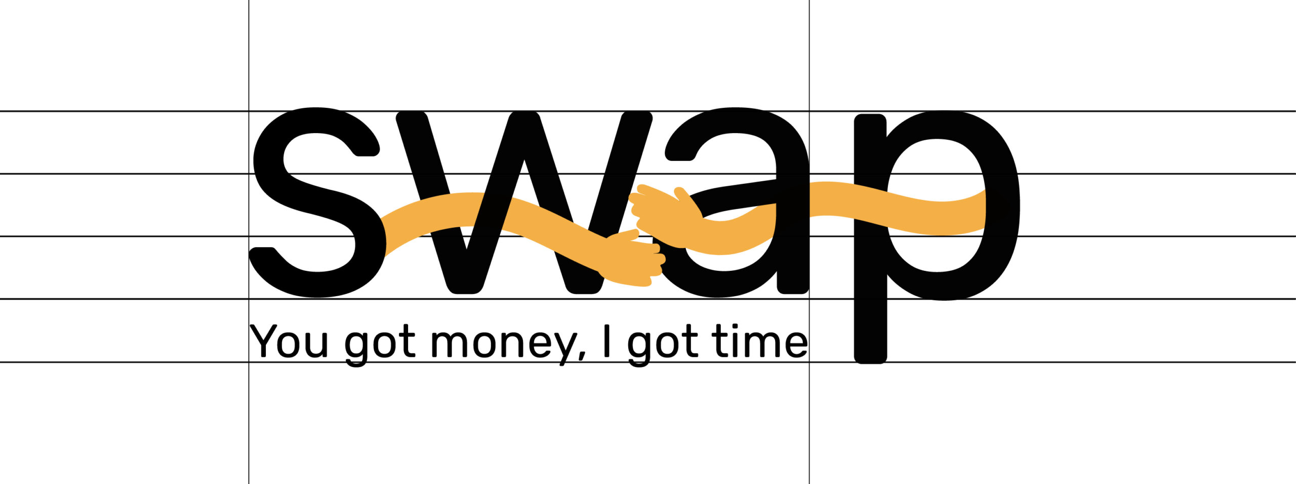
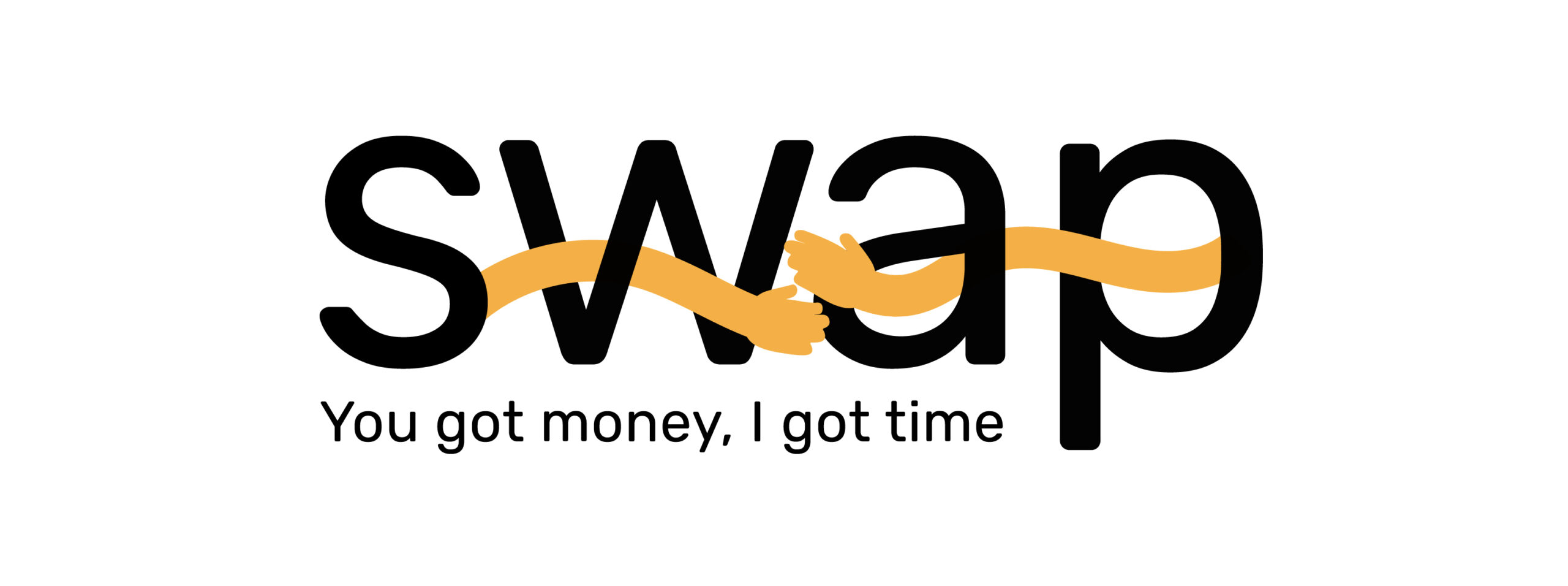
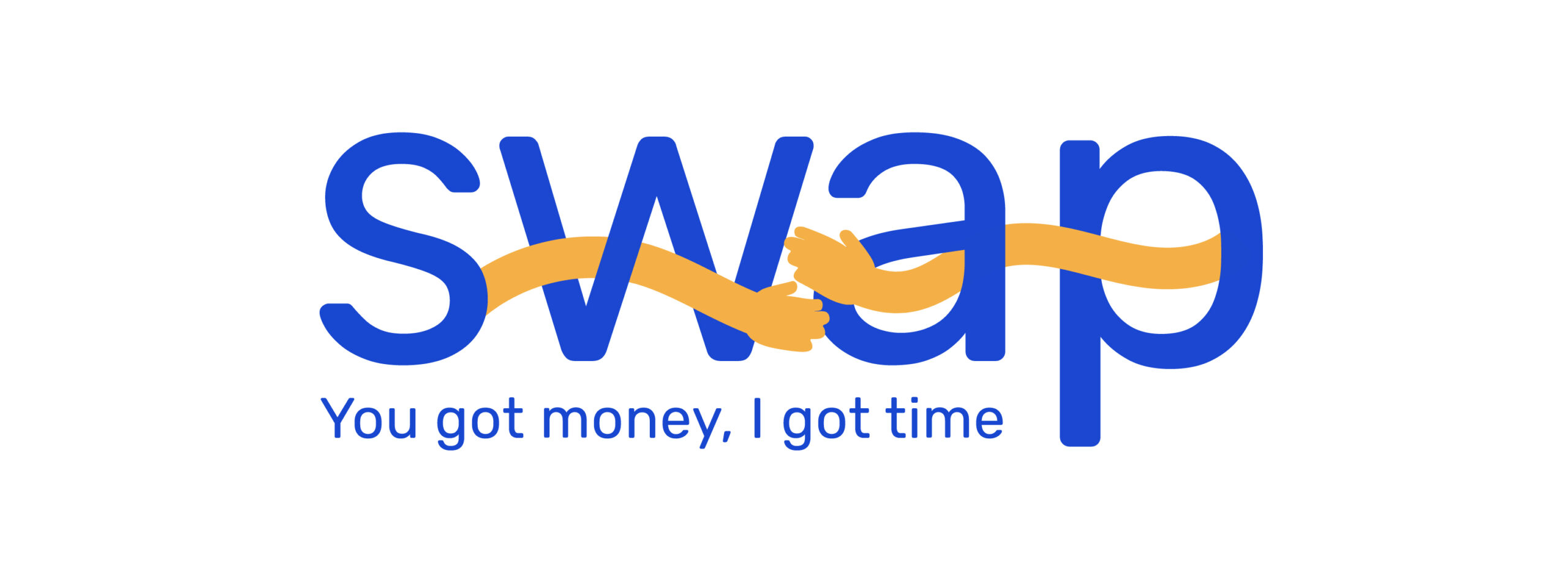
Logo
Design
The logo concept is inspired by an Israeli saying: “one hand washes the other” which reflects the spirit of mutual assistance and reciprocity. The visual identity translates this idea into a symbol of two hands reaching toward one another, representing connection, collaborating.
Branding Color
Color Palette
The primary colors, white and blue, reflect clarity, trust, and the Israeli market focus. Supporting colors – green, yellow, and black – add balance, vibrancy, and contrast for a clear and engaging user experience.
Asparagus
#679436
Hunyadi Yellow
#F4B046
Jet
#2f2f2f
Violet Blue
#1847D0
Anti-Flash White
#F1F5F6
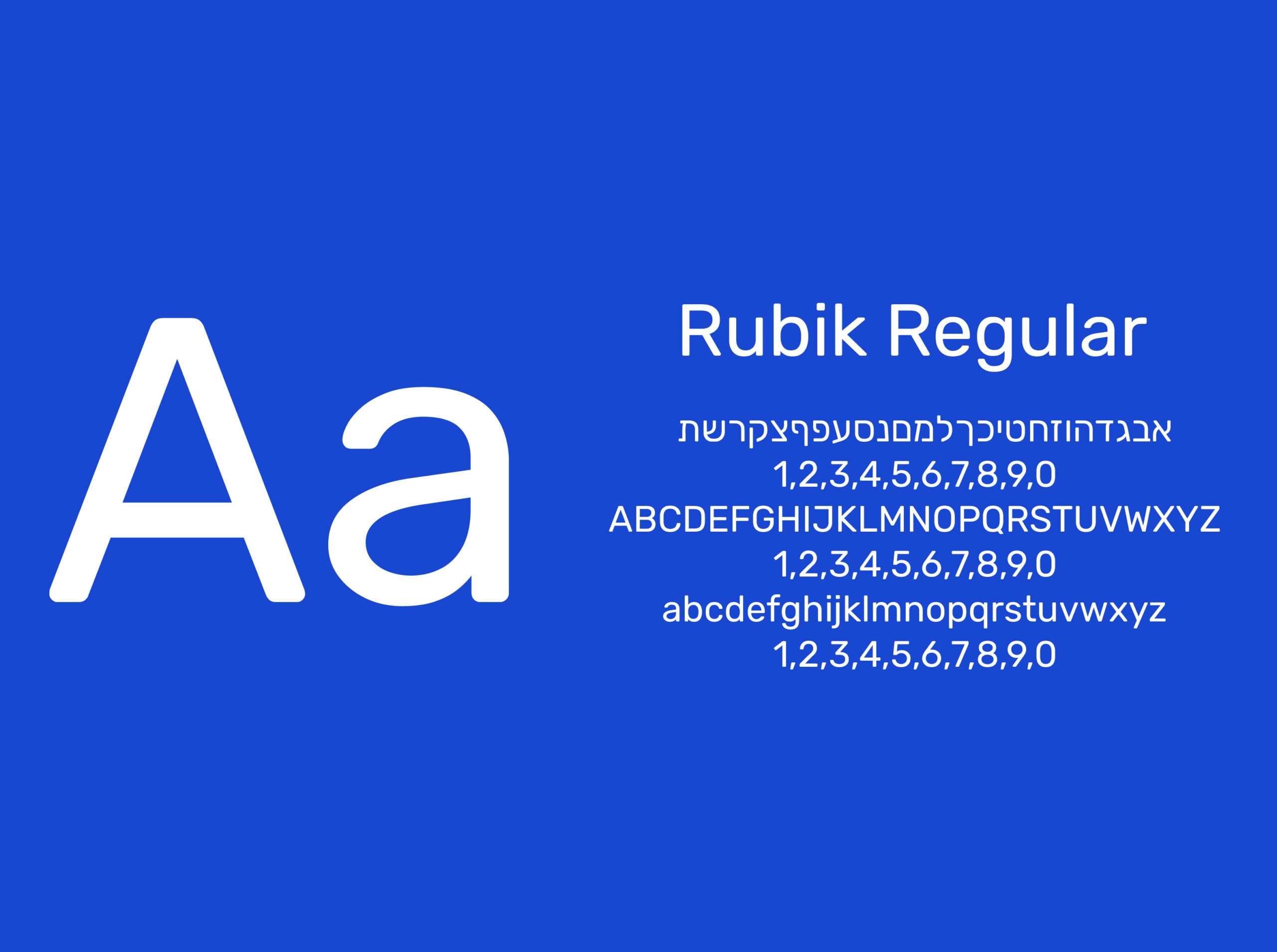
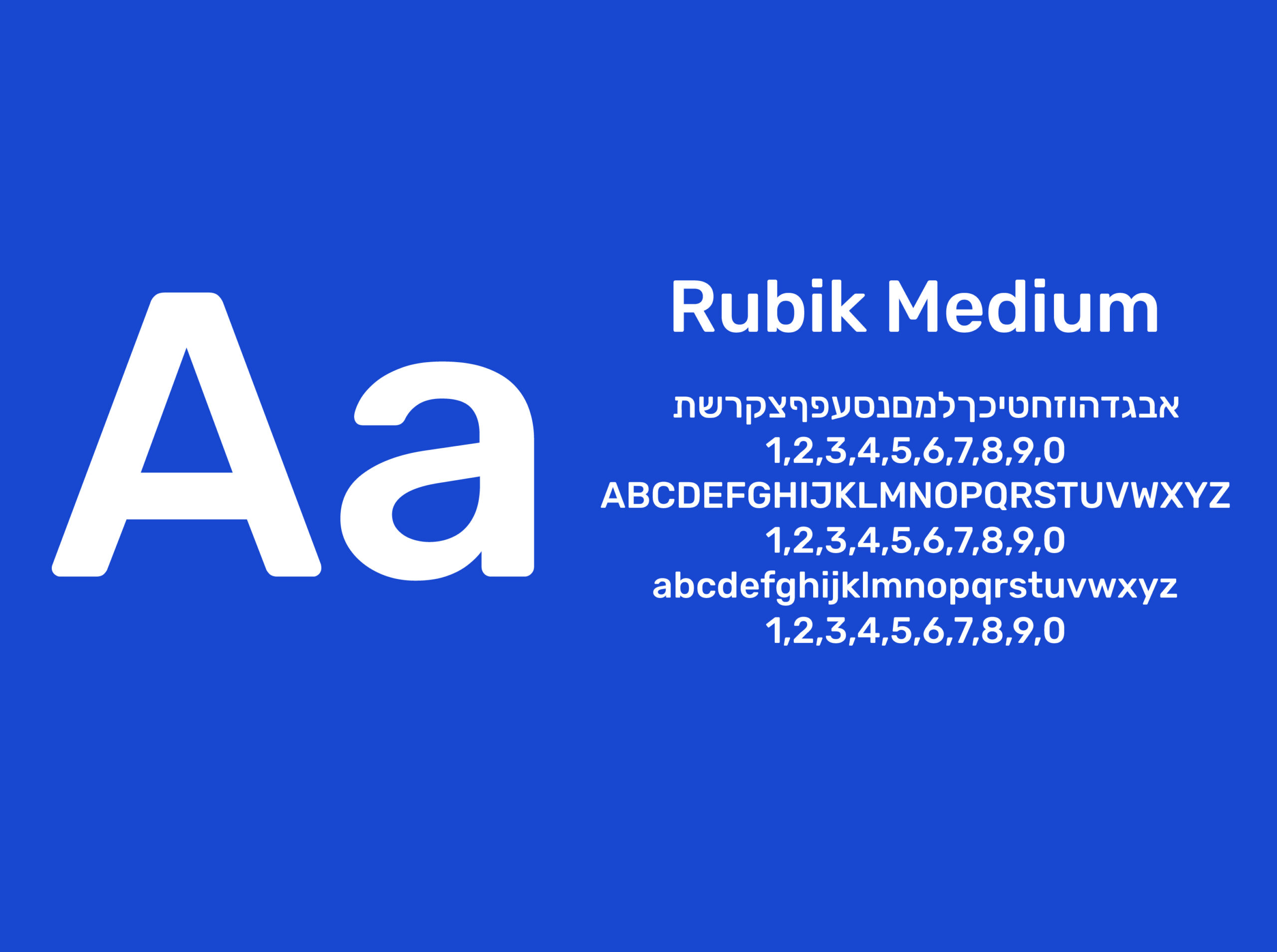
Typography
Font Rubik
For the SWAP application and logo, the Rubik typeface was chosen as a result of its modern, geometric design and excellent readability across digital interfaces. Its clean yet approachable character reflects the app’s innovative spirit while maintaining a sense of trust and accessibility, making it highly suitable for both branding and user interface design.
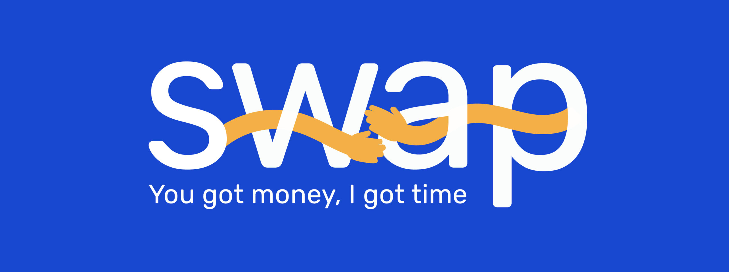
Logo Usage
Branding Color
The logo is consistently applied in the brand’s color palette to ensure visual harmony and brand recognition. Using the defined colors strengthens the identity, maintains coherence across platforms, and creates a unified, professional appearance.
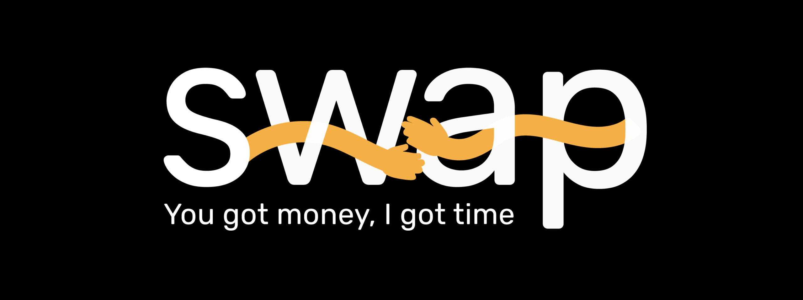
Logo Usage
Monochrome Color
The logo can also be applied in black and white to ensure versatility and clarity across different mediums. This version maintains brand recognition while providing flexibility for use in minimalistic designs, monochrome applications, or situations where color printing is not possible.
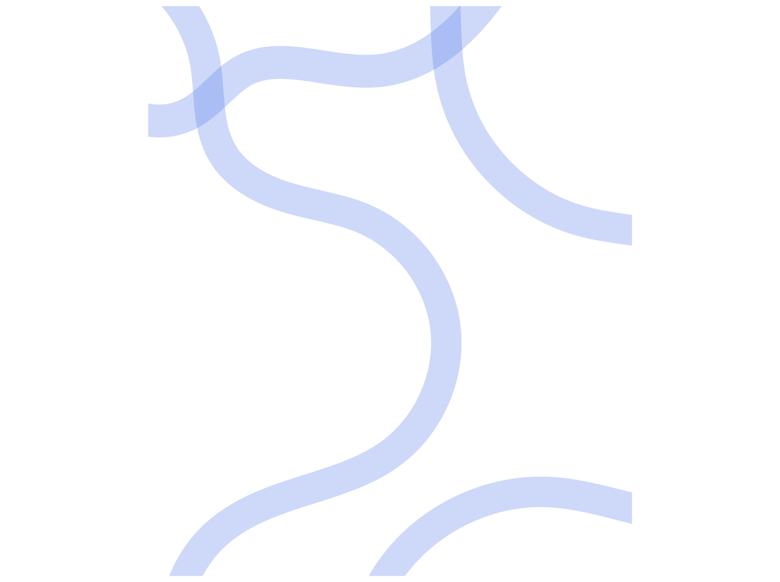
Pattern
Design
The idea for the pattern was inspired by the intertwining curves of the hands in the logo. This pattern was used in the onboarding background bringing a finished look to the overall design.
Brand language
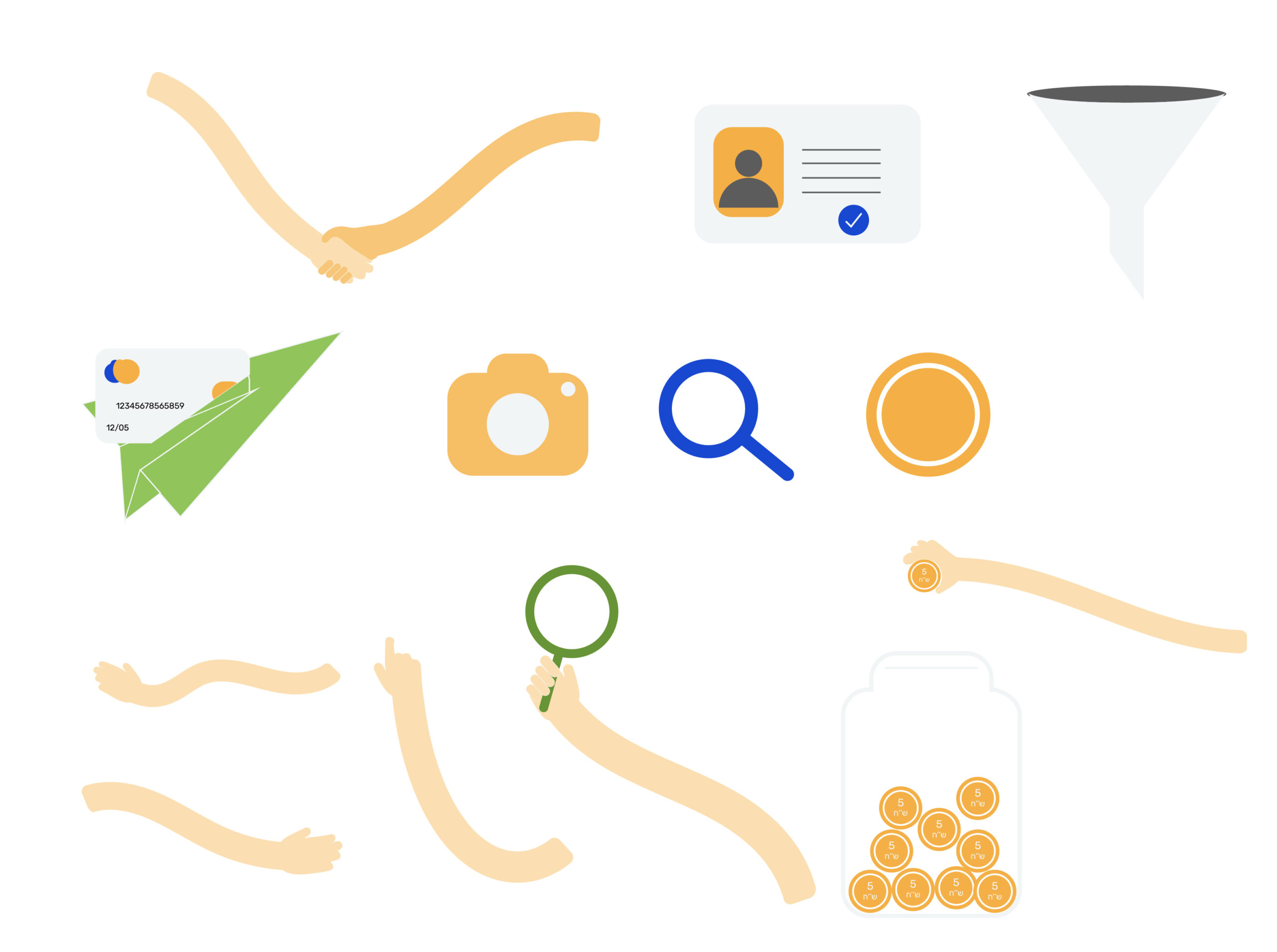
Design
I created custom illustrations to be used in the onboarding process. Through the integration of subtle animations, these illustrations contribute to making the application more welcoming, engaging, and suitable for users from different ages
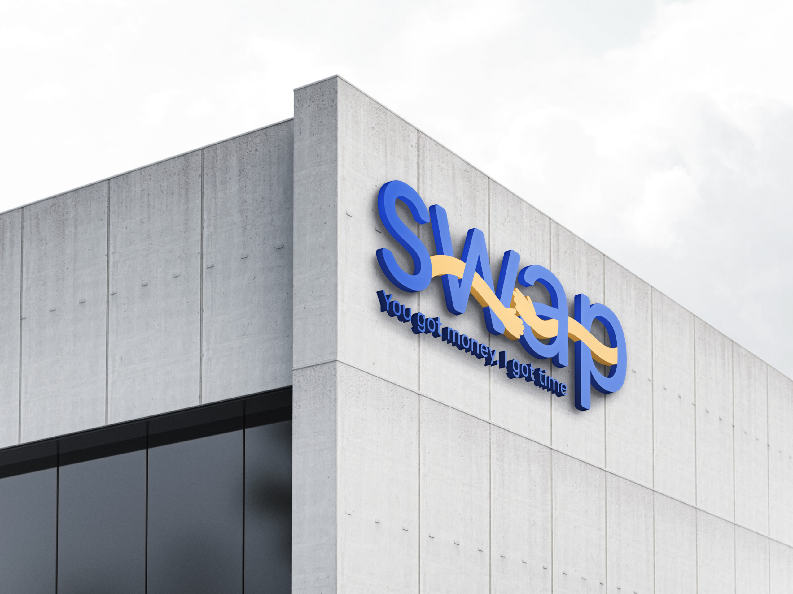
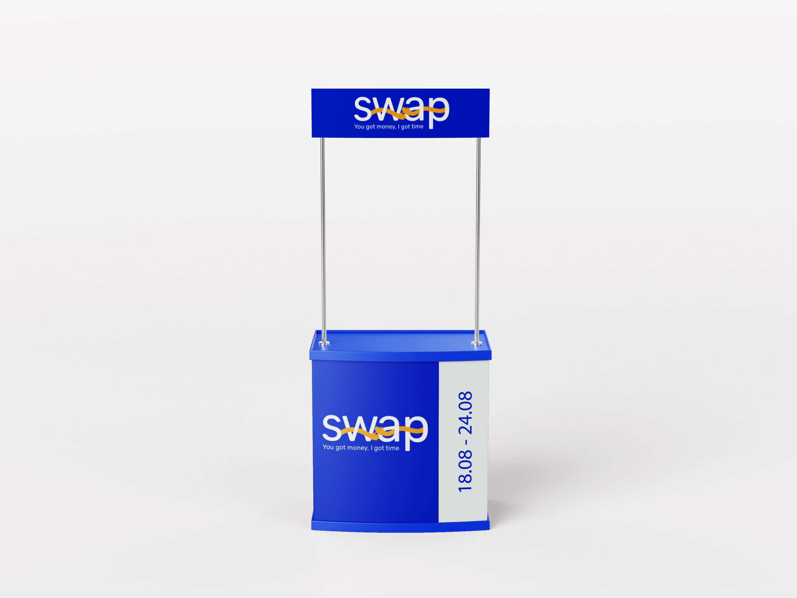
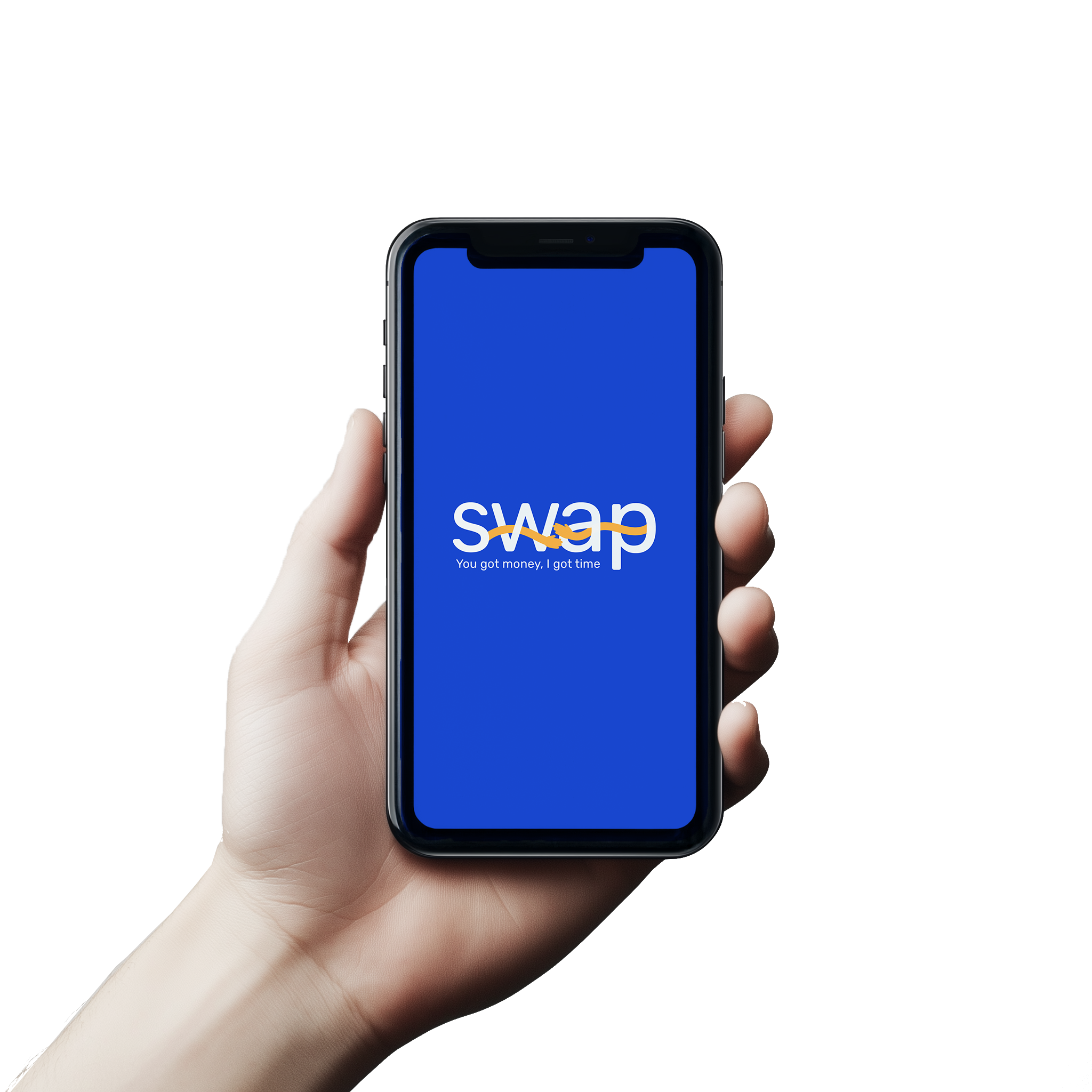
Mockups
Design
To illustrate the versatility of the design, the logo is presented through several mockups showcasing how it adapts across different contexts and real-life applications.
To view the entire project, including the application, click here link
Let's Create Something
Great Together
Have a Project in Mind?